


This weekend, I did some research on customer ratings on 3 popular ecommerce websites of India: Flipkart, Amazon and Snapdeal. I wanted to record the ratings and see if I can deduce any interesting patterns. Before starting this research, I did not really have an objective. I was not sure if I would get anything interesting out of this or not. It was more of an experiment than anything else.
Firstly, I could see that electronics and books had the most number of ratings. So, most of my recordings were focussed on these two segments so that I have enough data to validate.
Ratings Pattern
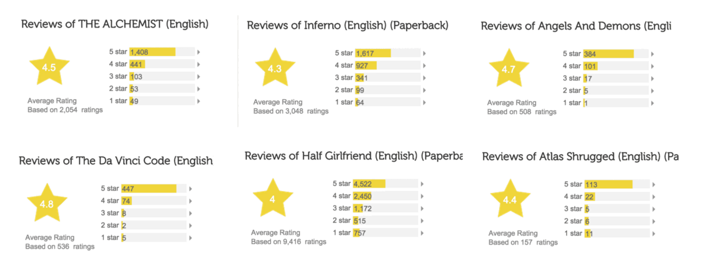
One strikingly interesting thing I observed: For any good electronic product with decent no. of ratings, the shape of the ratings almost always is like this:
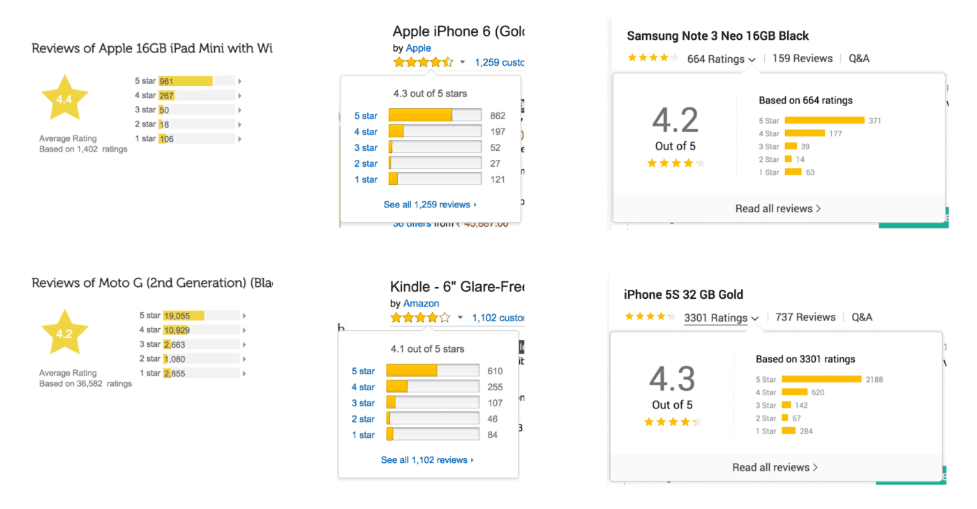
Peculiar shape emerged for customer ratings of electronic products from Flipkart, Amazon and Snapdeal.
For almost every product, no. of 5 star ratings were more than 4 star, followed by 3 and 2 but there is an increase in 1 star ratings.
This kept me thinking, I wanted to plot this data on some graphs.
Electronics: Happy Customers & Pissed off Customers
For each product, lets say,
X5 = No. of 5 star ratings
X1 = No. of 1 star ratings
t = Total ratings
Percentage of really happy customers, C1 = X5 / t
Percentage of really pissed off customers, C2= X1 / t
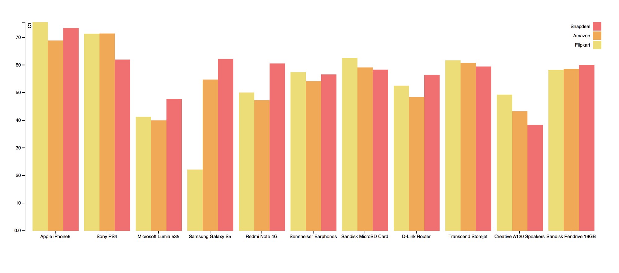
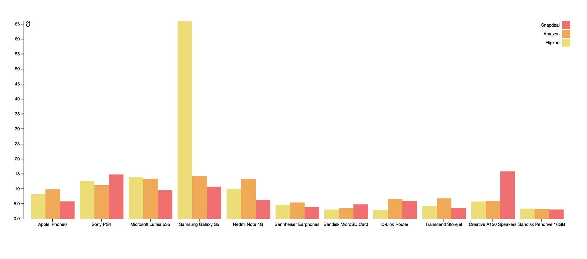
I plotted C1 and C2 of different products across the three websites
Some insights from these graphs:
- Expected result is that C1 and C2 should be more or less the same across all the sites. Observed result matches with the expected. So, yes, all three websites are more or less giving us the same kind of service.
- However, there are exceptions. For instance, something must have really gone wrong in Flipkart w.r.t. Samsung Galaxy S5 as C1 = 22% as compared to a C1 value of 54% and 62% for Amazon and Snapdeal respectively. Another example is Creative Speakers, where SnapDeal seems to have messed up a bit, as you can see from the graph.
- For most electronic products, C1 is staggeringly close to 55–65% across all the sites. i.e. Roughly 60% of customers are really happy about electronic products they purchase online.
- For products with more emotional attachment like the Playstation 4, C1 is a notch (~ 10%) higher than in case of mobile phones.
- Similarly, Premium products like the iPhone 6 have a significantly higher C1 than other mobile phones. People spending lot more money seemed to be very happy and rate their products much higher.
Now, I wanted to go a step further. Lets get 2 more variables into the picture for 4 star and 2 star ratings.
X4 = No. of 4 star ratings
X2 = No. of 2 star ratings
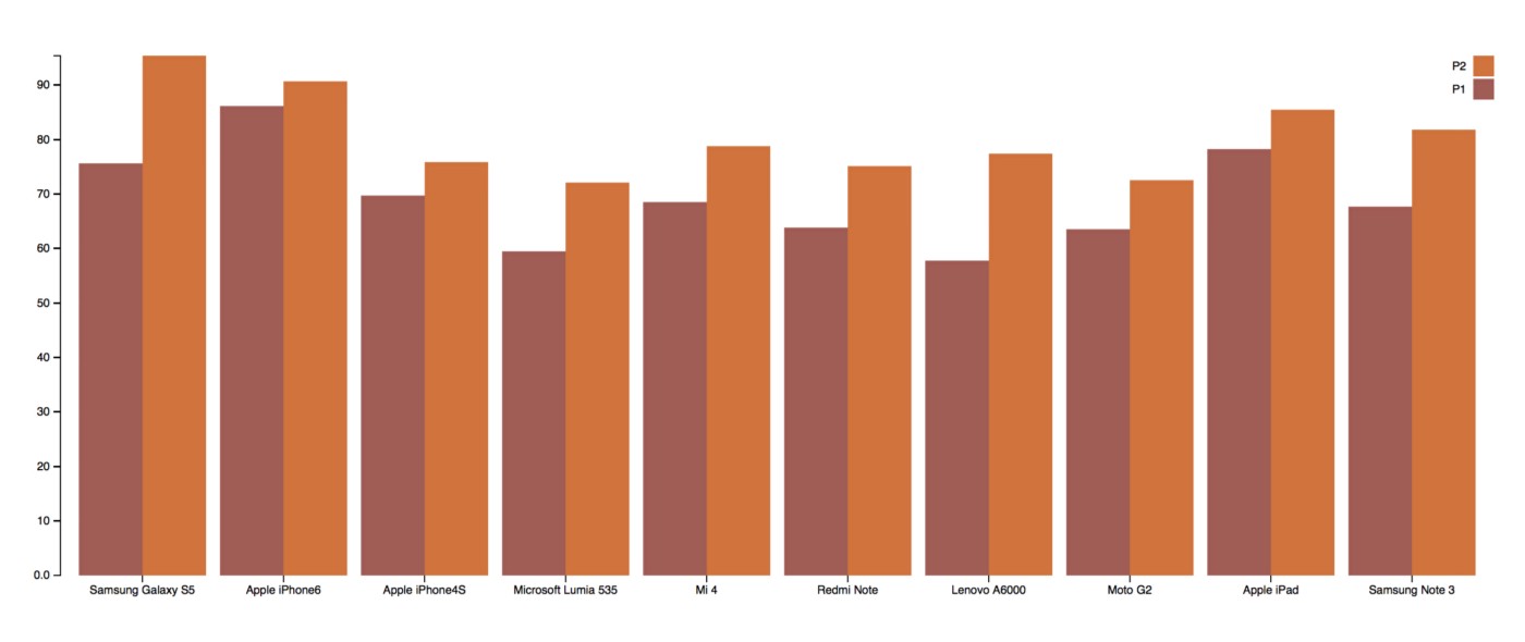
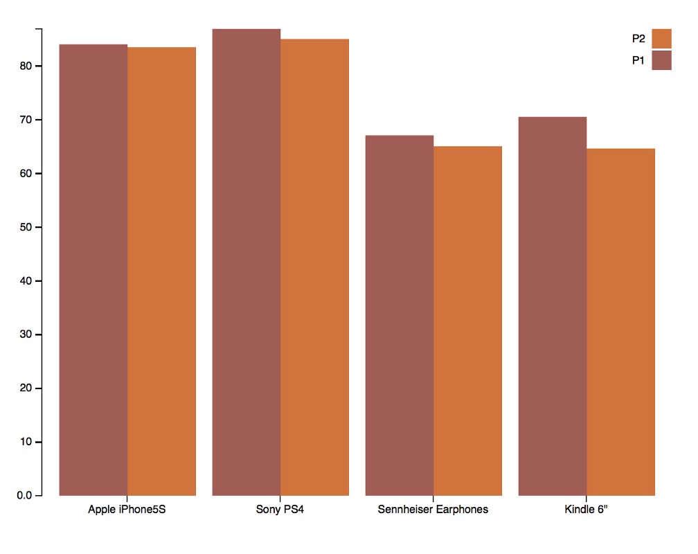
If a customer is happy, he could have rated 4 or 5 stars. Percentage of happy customers (4 & 5 stars) who rated 5, say P1 = X5 / (X4 + X5) * 100
Similarly, if a customer is not satisfied, he could have rated 1 or 2 star ratings. Percentage of unhappy customers (1 & 2 stars) who rated 1, say P2 = X1 / (X1 + X2) * 100
My assumption: P1 < P2 because people report frustration a lot more than happiness or in other words, Negativity has higher impact than Positivity.
I plotted P1 and P2 for various products and my assumption seemed to be true as you can see from the chart below!
However, there were some exceptions where P1 was slightly greater than P2 as shown below.
Books: Happy & Unhappy Customers
I repeated the same exercise for books. The ratings pattern for books mostly follow a simple descending order as shown below.
Points to note:
- In general, all good books usually have higher C1 values than electronics. Book lovers, if they like a book, they like it a lot. Even if they hate, they complain lesser than in the case of electronics (C2 values are lesser). To put this in perspective, take a look at the C1 and C2 values of 4 books and 4 electronic goods.
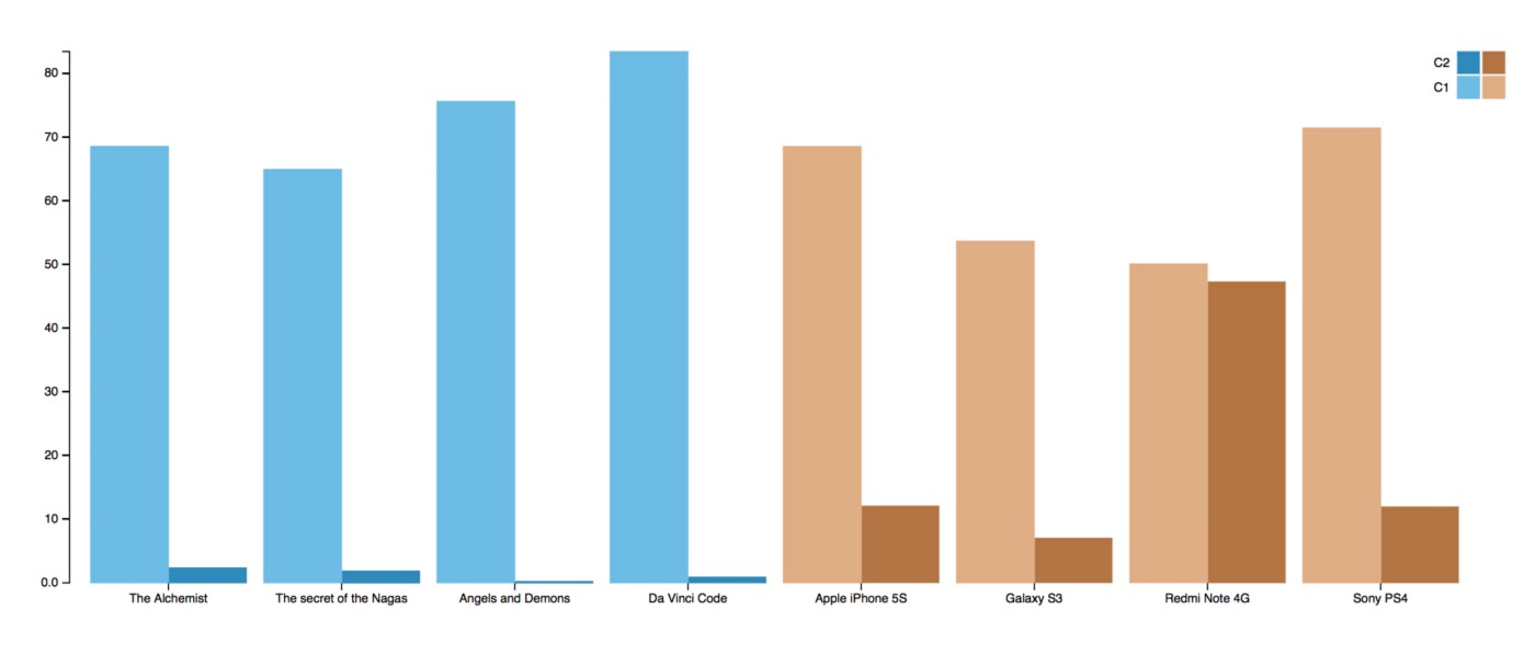
- For popular hit books like say The Da Vinci Code or Angels and Demons,C2 is almost zero! If people read a book, they are very happy and feel accomplished. If they complete a big, popular, hit novel, they don’t usually rate it low.
- For most books, P1 > P2 i.e. in case of books, positivity spreads more and has higher impact than negativity, as evident from the below graph.
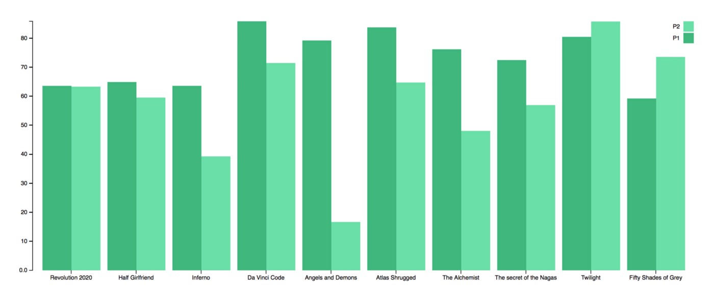
As you can see, most books have P1 > P2. Even the much hated Chetan Bhagat books have P1 slightly higher than P2. Of course, there are exceptions. Twilight and Fifty Shades of Grey, some of the most hated books in this world, have P1 < P2, which means they are really terrible.
This analysis may or may not be true but I am pretty sure with lot more data, we can get deeper insights into the shopping behavior of people from the ratings they give.